There are numerous points within the media music video "Cassius", by originally Indie band Foals and ancillary media texts of digipak and album advert whereby the use, development and challenge of typical forms and conventions of real media products is seen.
Firstly, these stereotypical elements can be dissected down into two main categories; form and convention.
Form consists of: Convention consists of:
- Camerawork - Themes
- Editing - Attitude
- Mise en Scene - Ideologies
- Special Effects - Style
VIDEO:
The camerawork seen within the music video uses a large proportion of close ups of the band members' faces; this is seen to use the conventions accordingly with the typical Indie music genre, as it is an essential element directed from record label producers.
This is due to the aesthetic promotion needed of the band themselves, to conjoin physical recognition with the music itself. This is particularly important, as Indie has always been regrded as a genre seen away from the usual larger mainstream labels.
 Inclusive of the camerawork is the actors themselves; it was seen in the initial audience research that it was preferable and more typical to see males within an Indie music video.
Also the reflection of artist to audience is crucial the the Indie genre in terms of style and costume. I felt this element was used particularly well, as specific males were chosen as it was noted that they had the certain Indie style, although as we were producing the video, we made listings of costume needed to be worn. As artists, the band themselves are the pinnacle of Indie style; the clothes chosen for music videos reaches thousands, if not millions of fans across the world. The band Foals are an Indie band, and therefore influence the depicted style of what the Indie fashion is or should be.
Inclusive of the camerawork is the actors themselves; it was seen in the initial audience research that it was preferable and more typical to see males within an Indie music video.
Also the reflection of artist to audience is crucial the the Indie genre in terms of style and costume. I felt this element was used particularly well, as specific males were chosen as it was noted that they had the certain Indie style, although as we were producing the video, we made listings of costume needed to be worn. As artists, the band themselves are the pinnacle of Indie style; the clothes chosen for music videos reaches thousands, if not millions of fans across the world. The band Foals are an Indie band, and therefore influence the depicted style of what the Indie fashion is or should be.


There are certain developments and challenges of the stereotypical Indie music genre also; our editing included a lot of repetition and speed reversals, something that we felt fitted the pace of song and genre, however is rarely seen in typical Indie music videos. Similar to this was own use of special effects such as stop motion in developing the genre, as aforementioned, it is something that currently is seldom seen within this particular genre of video.
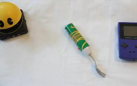
Accompanying the use of stop motion, was the props within the video. The original Cassius video lacked a particular narrative and storyline, therefore there were no specific props needed to follow.
The props used included:
 -Balloons
-Glitter
-Paint
-Starbucks cup
-Pot Noodle fork
-PacMan Clock
-Rubix Cube -Polaroid Camera
 -Gameboy
This use of props was very particular, in the sense that they appear to represent the typical lifestyle of the Indie fashion; the props reflected the lifestyle of the band themselves which in turn promotes what the Indie lifestyle should be towards fans. This developed the certain codes and themes within an Indie genre music video, as props aren't incorporated hugely within the videos. This concept was taken from the original Cassius video, primarily to include some of the primary techniques and methods from the real band and music video itself.
DIGIPAK:
The digipak we produced competently uses the typical forms of existing digipaks; the continuity between ancillary texts of a photographic still from the music video, to the repeated use of the same image into the digipak and album advert. This creates a unity between the media products, and allows its audience to see this synergy.
Although on appearance the connection between each product is visible, the contents of the actual digipak challenges and in some cases has disregarded the typical conventions and codes of existing Indie digipaks.
It specifically lacks any form of booklet or removeable paper, usually containing additional photographs of the band or exclusive band knowledge. There is also no lyrical sheet, usually seen within this form of media product. It only contains outside front album artwork, inside DVD and CD trays, and back cover artwork with track listings.
ADVERT:
Our music album advert carried the use of continuity and synergy from the media product to ancillary texts through the use of repeated main image of the band. They are seen mid-play accompanied by instruments on location. I felt that the advert was effective as it contained the typical codes and themes recurrent within other existing album adverts.
Below is an example of pre-existing continuity of image between album cover (digipak cover) and advert, of Indie band Foals. The advert includes the original album artwork, the band name and single title. It also shows additional features and the band website.
The album advert we produced used these conventions, and included:
- Band name
- Album title
- Continuity from digipak through use of photographic still from the music video
- Album release date
- Band website
- Record label image
- Legal information required
As well as this, these conventions were developed through the use of Quick Response (QR) Code in the bottom right corner. From audience research and living in this society ourselves, the use of newer, faster technology is constantly being used and developed within the Media. Social networking sites such as Facebook, Twitter, MySpace and YouTube are available to newer smartphones as the social history of networking is evolving. The availability of the use of this QR Code would mean a faster response from fans of the band; they would be able to download the album or receive band news and information at a quicker rate, something that is becoming an increasing demand with the particular demographic of the Indie genre.
I feel that this music album advert has also developed the usual conventions and codes from other adverts, especially from the British band Foals, as their artwork is gradually evolving over their existence within the mass media and fanbases.
 Extended Plays (EPs) such as "Gold Gold Gold", and "Red Socks Pugie", as well as albums "Antidotes" have all used hand draw, illustrative artwork as covers since 2008. However the release of 2010 album "Total Life Forever" saw the change from illustration to photographic image; a convention more typically seen from American- Indie bands such as The Drums. Our use of photographic image not only creates the synergy between the media products but develops the growth and maturity of artwork from the band itself.
Overall, the media product appeared to be very well received, looking at the audience feedback survey as shown below.